top of page
Case Study: Homestead
RESPONSIVE WEB APP
Project Overview
Homestead is a responsive app designed to empower individuals wanting to purchase a property to live off-grid.
It aims to filter the property market by offering specific remote locations, providing them with easy access to affordable properties all around the world.
Homestead aims to make the process of finding and acquiring off-grid properties easy.
.
Role:
Duration:
Tools:
UX/UI Designer
6 months
Challenges
Many young professionals can't afford to buy their own property in large cities and they need to consider investing money elsewhere. Finding affordable property across different countries is challenging.
Problem Statement
Users are unable to find cheap off-grid properties that are located across different countries at one platform.
User Needs
Users need a single platform for searching for affordable properties all around the world suitable for off-grid living.


User Stories
Based on the user research, the following conclusions were made.
As a user I want to:
-
create a profile containing all my property criteria, so that I can recommend results most relevant to me
-
search and filter properties, so that I can find good matches based on my needs
-
save or mark properties I am like, so that I can easily revisit them
-
I want access to written and visual information so that I can make an informed decision
-
contact the property owner
-
see how well a property meets my criteria
I have decided to use the first mood board, as it might speak to a wider range of audiences such as people who are interested in:
-
self-sufficient living
-
living off grid
-
environmentalism
-
adventure seekers & nature lovers.
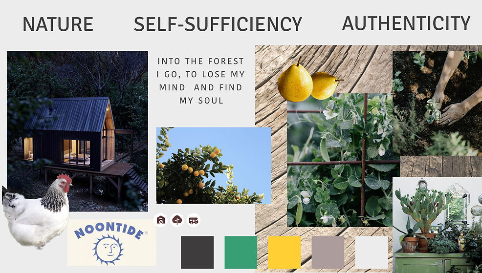
Mood Board
Focusing on the visual aspect of my app, I have created two mood boards that both resonated with nature.
Grids
4 Columns
74px
Margins:
2x16px
Rows:
4px
MOBILE
8 Columns
79px
Margins:
2x20px
Rows:
8px
TABLET
DESKTOP
12 Columns
95px
Margins:
2x40px
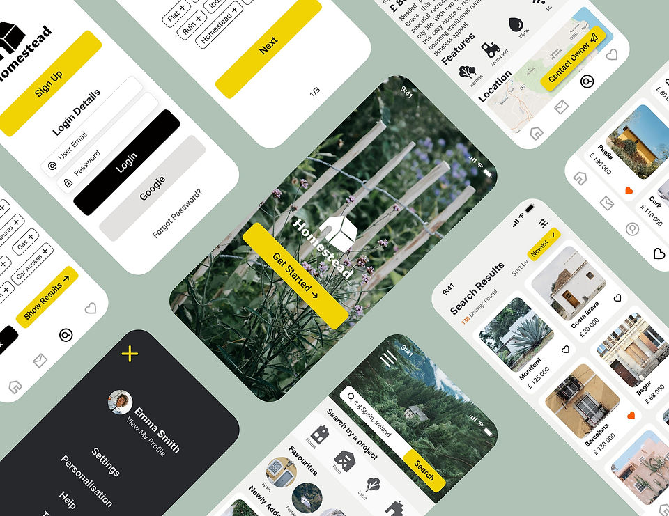
Mid-Fidelity Prototypes

LOGIN SCREEN

PROPERTY SEARCH
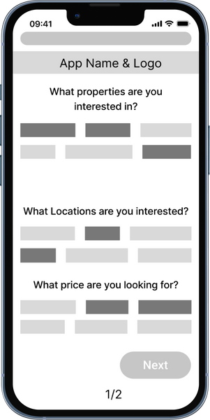
ONBOARDING
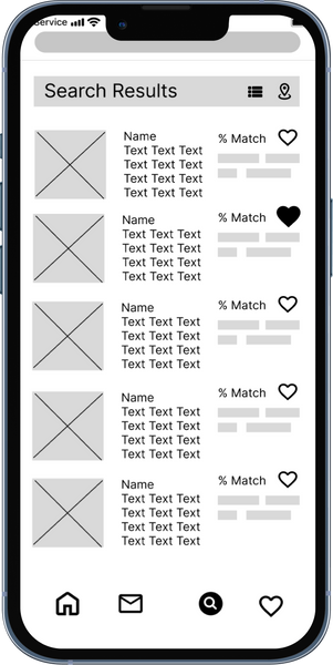
SEARCH RESULTS
HOME SCREEN
SEARCH RESULT DETAIL
Style Guide: Logo
I have created a simple but strong minimalistic logo, that won't distract the user from other visuals but at the same time, even new user will be quickly able to guess the purpose of the app itself.
VERTICAL LOGO FOR MOBILE

HORIZONTAL LOGO FOR DESKTOP

ICON LOGO FOR TABLET


Style Guide: Typography
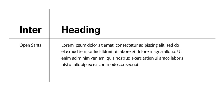
HEADING
BODY
Style Guide: Colours

Although I haven't used any green colour in this project, I have relied on green imagery that surrounds most of the imagery.
To balance cold tones of green, I have chosen yellow as my primary colour.
My secondary colours are black, white and grey to keep a minimalistic look and not to overwhelm users.
I have additionally used orange, as a prompt colour for "favourite" icons.
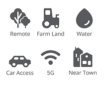
Style Guide: Iconography
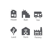
PROPERTY TYPE
PROPERTY FEATURES
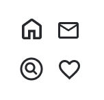
NAVIGATION

BUTTONS
The Homestead app has specific icons that were collected from different sources. I have edited the colour and roundness of their edges to make them look consistent.
Style Guide: UI Elements
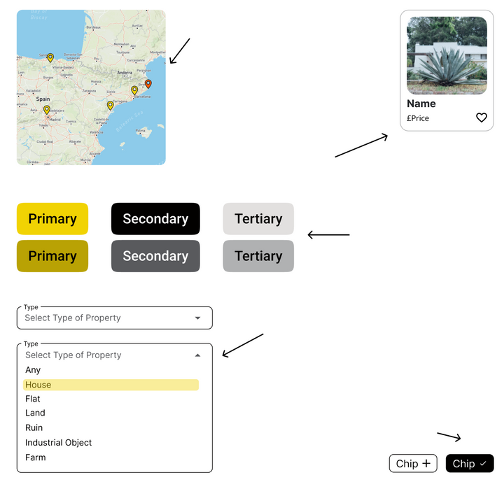
MAP
Property locations are marked with yellow colour. When hovering location tag changes to orange to stand out from other tags.
BUTTONS
Buttons and its states (default, pressed, disabled) are consistend with the colour theme with contrasting text and icons.
PROPERTY SEARCH CARDS
DROPDOWN
Dropdown options are each hightlighted in yellow background while user hovers over them.
CHIPS DEFAULT & SELECTED
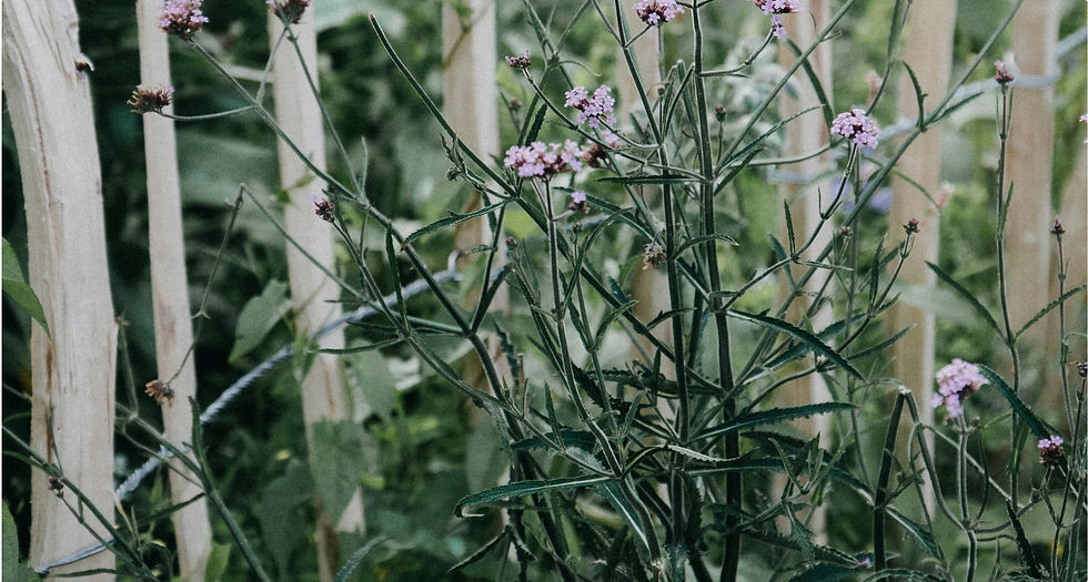
Style Guide: Imagery

IMAGE REQUIREMENTS
Use:
-
Slightly pale images
-
Organic/Rustic looking images with plants/greenery
-
Round edges to 10
-
Images that show the whole property unless it's a terraced house/flat
Avoid:
-
images with high level of brightness and warmth (reduce saturation in image filter to low)
-
images with people (except for profile images)
-
images made on set
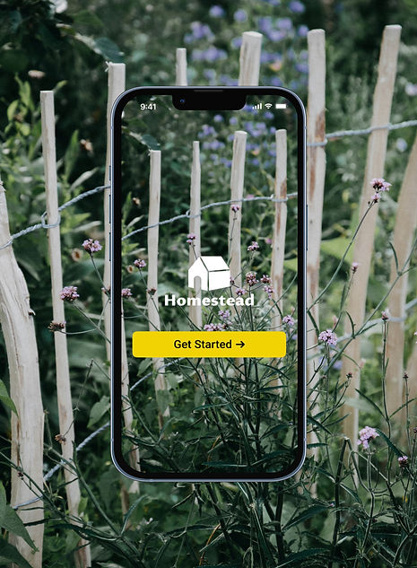
Mobile Version
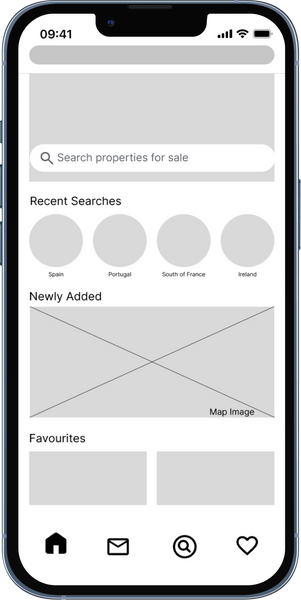
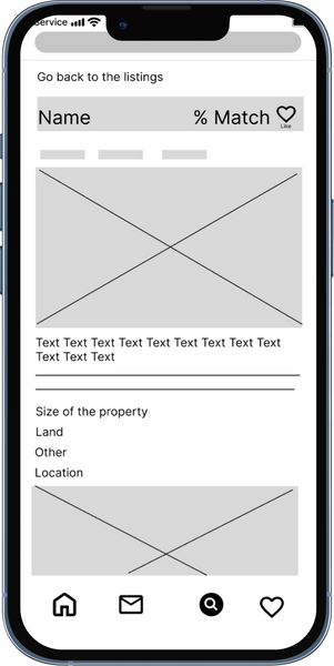
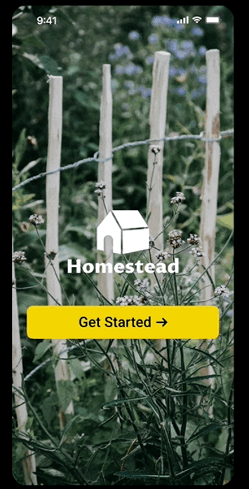
High-Fidelity Prototypes - Search for property

SPLASH SCREEN
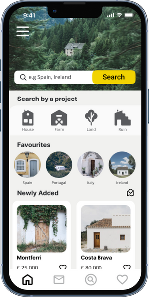
HOME SCREEN
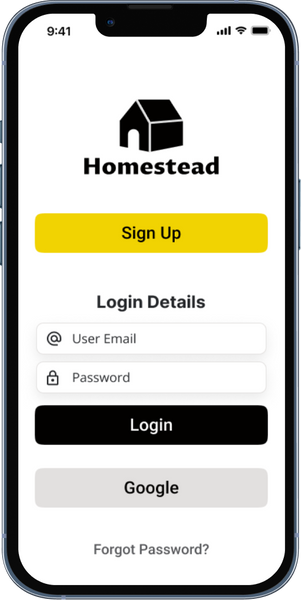
LOGIN SCREEN
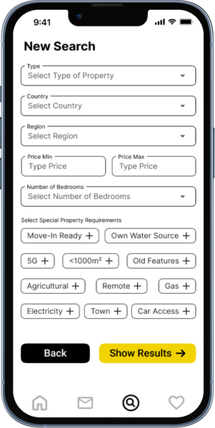
SEARCH
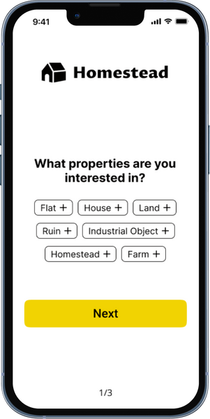
ONBOARDING 1
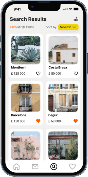
SEARCH RESULTS
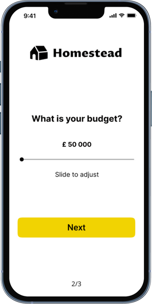
ONBOARDING 2

SEARCH RESULT DETAIL
Tablet Version
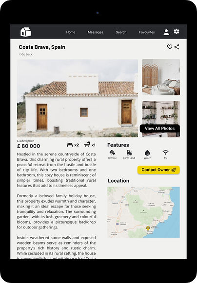.jpg)

For the tablet version of the Property Detail Screen, I have used the advantage of extra horizontal space and added more visible property images on the side as well as a location map.
Desktop Version

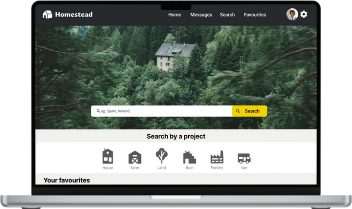
Homestead App Prototype

bottom of page